
こんにちは、のっくんです。
この記事では、PythonのMatplotlibを使ってヒストグラムを表示してみます。
大量のデータを分析するときに、Matplotlibを使って可視化することで見やすくなります。
Pythonなら数行のコードで書けるのでぜひ試してみてください。
[toc]
事前準備
matplotlibとpandasを使います。
Anacondaを使っている場合は以下のコマンドでインストールできます。
conda install pandas
conda install -c conda-forge matplotlib
使用するデータ
NYCflights13 dataを使います。これは2013年のニューヨークを出発した航空会社ごとの遅れた時間が含まれています。
データ数は30万以上のリアルなデータなので、分析にはもってこいのデータですね!
実際に中身をみてみましょう。
# 最初の10行を表示するよ!
flights = pd.read_csv('formatted_flights.csv')
flights.head(10)
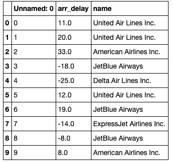
各航空会社ごとのデータが入っています。
到着時刻がマイナスになっているのは、到着が早まったと言うことでしょう。
ヒストグラム
# matplotlibのヒストグラムを設定するよ
plt.hist(flights['arr_delay'], color = 'blue', edgecolor = 'black',
         bins = int(180/5))

# ラベルを追加するよ
plt.title('Histogram of Arrival Delays')
plt.xlabel('Delay (min)')
plt.ylabel('Flights')
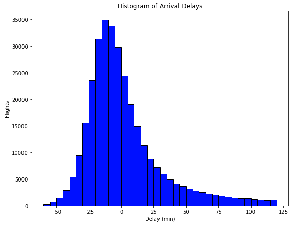
30万のデータが一目瞭然ですね。遅れるよりも少し早めに到着する飛行機が多いのがわかります。
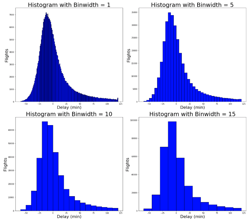
ビン幅を調節する
ビン幅をそれぞれ調整して4つのグラフを表示してみましょう。
# 4つの異なるビン幅で表示してみる
for i, binwidth in enumerate([1, 5, 10, 15]):

    # Set up the plot
    ax = plt.subplot(2, 2, i + 1)

    # Draw the plot
    ax.hist(flights['arr_delay'], bins = int(180/binwidth),
             color = 'blue', edgecolor = 'black')

    # Title and labels
    ax.set_title('Histogram with Binwidth = %d' % binwidth, size = 30)
    ax.set_xlabel('Delay (min)', size = 22)
    ax.set_ylabel('Flights', size= 22)

plt.tight_layout()
plt.show()
航空会社ごとにヒストグラムを表示する
Matplotlibのヒストグラムでは、カテゴリごとに別の色でヒストグラムを表示することができます。
side-by-sideヒストグラムと言います。
# Make a separate list for each airline
x1 = list(flights[flights['name'] == 'United Air Lines Inc.']['arr_delay'])
x2 = list(flights[flights['name'] == 'JetBlue Airways']['arr_delay'])
x3 = list(flights[flights['name'] == 'ExpressJet Airlines Inc.']['arr_delay'])
x4 = list(flights[flights['name'] == 'Delta Air Lines Inc.']['arr_delay'])
x5 = list(flights[flights['name'] == 'American Airlines Inc.']['arr_delay'])

# Assign colors for each airline and the names
colors = ['#E69F00', '#56B4E9', '#F0E442', '#009E73', '#D55E00']
names = ['United Air Lines Inc.', 'JetBlue Airways', 'ExpressJet Airlines Inc.',
'Delta Air Lines Inc.', 'American Airlines Inc.']

# Make the histogram using a list of lists
# Normalize the flights and assign colors and names
plt.hist([x1, x2, x3, x4, x5], bins = int(180/15), normed=True,
         color = colors, label=names)

# Plot formatting
plt.legend()
plt.xlabel('Delay (min)')
plt.ylabel('Normalized Flights')
plt.title('Side-by-Side Histogram with Multiple Airlines')
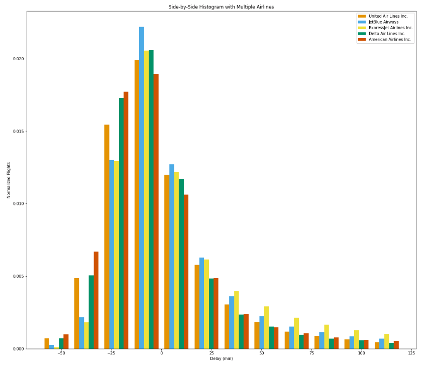
カラフルで良いですが、ラベルとバーが一致していないので見方がよく分からない図になってしまいました。ヒストグラムだけでは、複雑なデータを扱うのは難しいですね。
Density Plotという方法が良いらしいので時間があったら今度やってみようと思います。
おわり。
参考
Medium,
https://towardsdatascience.com/histograms-and-density-plots-in-python-f6bda88f5ac0